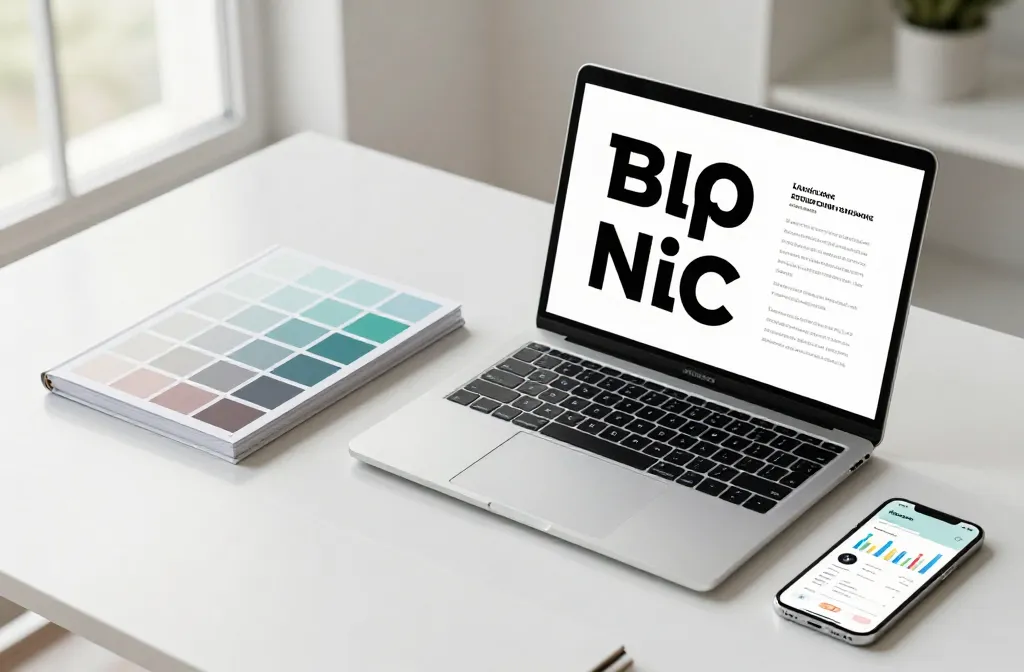
Ready to upgrade your brand vibe without重新branding your entire life savings? If you want to look polished, consistent, and a little irresistible, you’re in the right spot.
These ideas are practical, fun, and totally doable for real businesses with real budgets. FYI, a cohesive aesthetic can do more for trust and conversions than a flashy ad ever could.
Stick with me and we’ll build a vibe that makes your audience stop scrolling and start buying. Let’s dive in and make your feed glow with intention.
1. Define a Signature Color System

A cohesive color system is the backbone of any stylish online presence. Pick 2 primary colors and 2 accent colors, then use them consistently across all platforms.
When you reuse exact shades, your posts instantly feel intentional and professional. Seriously, consistency saves you from brand confusion and boosts recognition.
Tip: create quick swatches and pin them in your design folder so everyone on your team uses the same palette.
- Primary color 1
- Primary color 2
- Accent color A
- Accent color B
Use this system for posts, stories, product pages, and emails to keep your aesthetic intact.
2. Craft a Minimal Typography Rule
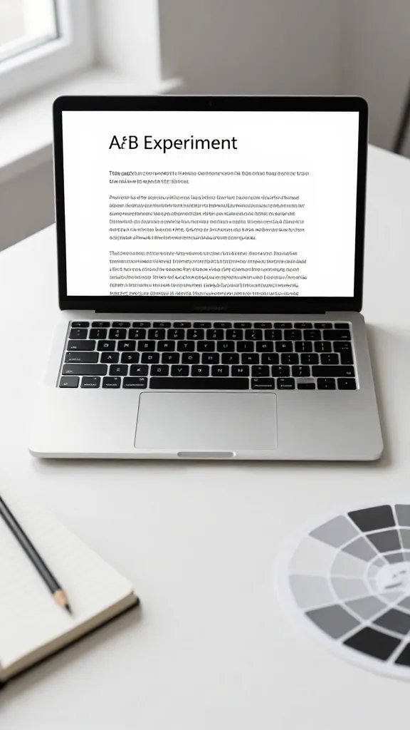
Typography is more powerful than you think. Choose one clean sans serif for headers and a readable serif or sans for body copy.
Limiting fonts reduces visual noise and makes content skimmable. It also gives your brand a confident, no-nonsense vibe.
Key points: hierarchy, readability, and consistent line heights. Want to test fonts? A quick A/B in a month is enough to know what sticks.
3. Build a Visual Grid That Feels Like a Magazine
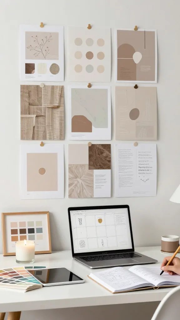
Social feeds that look curated get attention. Create a grid plan where each row or block has a unifying idea—colors, textures, or a recurring motif.
This feels high end without needing a full design team. It also makes it easier to batch-create content on a Sunday and post all week.
Tips: sketch 2 weeks of posts in advance and rotate a signature motif every third post for rhythm.
4. Use Consistent Photo Styling

People notice photos that glow with the same lighting and editing vibe. Decide on a lighting style, a camera distance, and a slight color lift that matches your palette.
Pro move: keep a preset for editing so every new shot slots into your look instantly. No more frantic color wrangling at 11 pm.
Common elements to lock in include warm shadows, natural light, and a consistent focal point in product photography.
5. Elevate Your Brand Photography with Props

Props tell a story and make scenes feel human. Use items that reflect your niche and your audience’s daily life.
Keep props simple so they don’t steal the show from your product. Trust me, the right prop adds personality without clutter.
Try a small selection of props like a clean notebook, a plant, a coffee cup with your logo, or a textured throw to add warmth.
6. Create a Signature Layout for Every Channel

Different platforms have different quirks, but you can keep a recognizable layout across all of them. Think header treatment, body space, and footer cues that signal your brand instantly.
This reduces guesswork for your team and gives your audience a familiar, comfortable browsing experience. IMO, familiarity builds trust faster than any clever caption.
Implementation ideas: a fixed header bar on images, a bottom call to action, and a repeating corner watermark.
7. Master the Art of Subtle Motion

Motion breathes life into flat images. Use gentle parallax, micro-animations on buttons, or short looping clips to hint at energy without distraction.
Motion should feel like a natural extension of your aesthetic, not a flashy distraction. FYI, too much motion can be exhausting for some users.
Practical tips: limit to 2 seconds, keep loops seamless, and ensure accessibility with alt text and caption previews.
8. Curate a Toolset that Reflects Your Brand
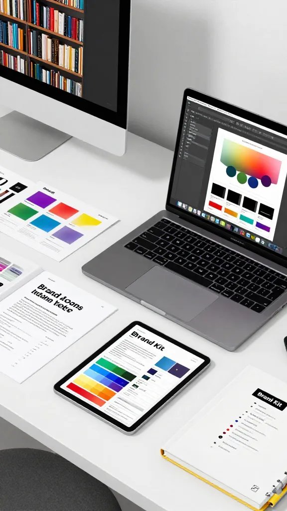
Use a consistent set of tools for design, editing, and publishing. A shared library speeds up production and keeps output uniform.
When your team uses the same fonts, presets, and templates, your brand looks professional even on busy days. Seriously, avoid the chaos of everyone designing in their own way.
What to include: brand kit, editable templates, tone of voice and image use guidelines.
9. Build a Pixel-Perfect Website Experience
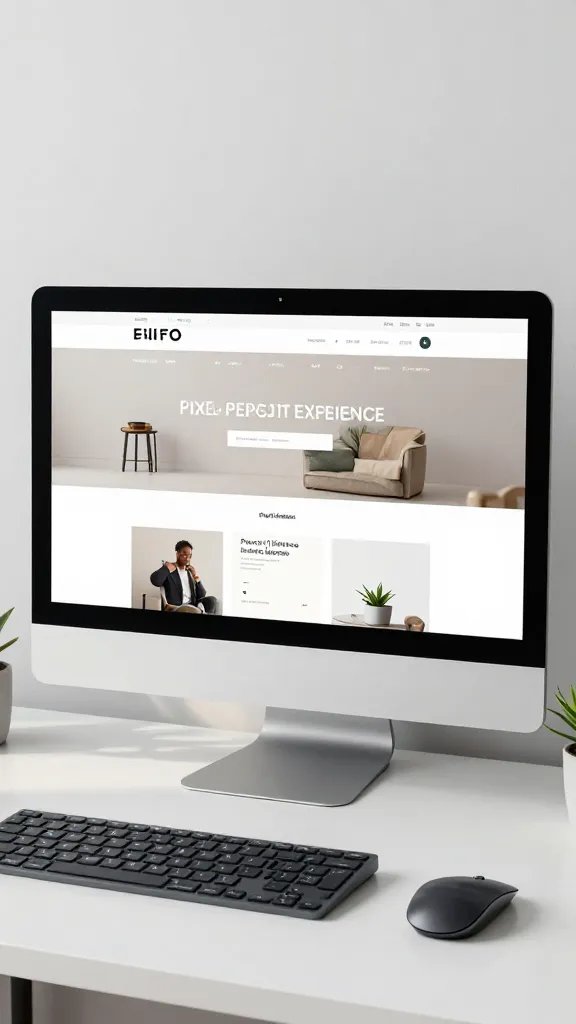
Your website is the showroom for your entire brand vibe. Align fonts, colors, photography, and copy across every page for a seamless journey.
Keep navigation intuitive and the product pages crystal clear. A polished site continues to convert long after you publish it.
Boosts you’ll notice: lower bounce rates, higher trust, and longer on-site time. Boosts should feel like a gentle win, not a data dump.
10. Elevate Product Imagery with Consistent Angles
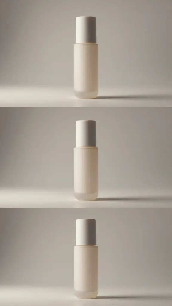
Choose a few product angles that you shoot every time. Consistency makes your catalog feel cohesive and premium.
Combine with a consistent background and lighting to create a recognizable family of images. This makes it easy for customers to compare and trust what they see.
Bonus: create a quick shot list and stick to it in every shoot. Your future self will thank you when you don’t have to reinvent the wheel.
11. Build a Signature Copy Style You Can Hear

Voice matters as much as visuals. Write like you talk with a touch of personality, but keep things concise and clear.
Use short sentences, friendly humor, and confidence in every caption. This makes your brand approachable and memorable.
Checklist: conversational tone, active voice, and consistent punctuation. The result is copy that sells without sounding salesy.
12. Implement a Visual Hierarchy That Guides the Eye
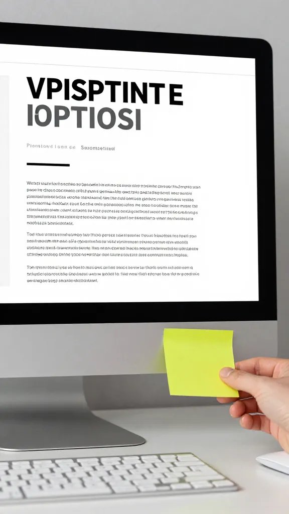
Hierarchy is your secret weapon for skimmable content. Structure headlines, subheads, and body text so readers move easily from attention to action.
Use contrast, whitespace, and alignment to steer attention toward the most important parts of your post or page.
Practical notes: use bold for key phrases, keep paragraphs short, and place call-to-action where eyes naturally land.
13. Curate Consistent Brand Icons and Illustrations
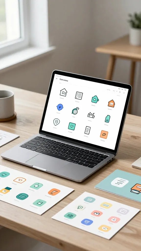
Custom icons and illustrations reinforce your vibe and help complex ideas land quickly.
Keep a small library that matches your color system and line weight. This makes infographics and feature explanations feel cohesive.
Use sparingly to avoid visual overload—let them clarify rather than clutter.
14. Establish a Brand Language for Product Education

Educational content that matches your aesthetic helps customers feel confident buying from you.
Design short how-to guides, FAQs, and product stories in a consistent format. Simple templates keep education on brand and on time.
Tip: batch-create learning posts and place them in a predictable slot on your editorial calendar.
15. Design a Lightweight Content Calendar That Sticks
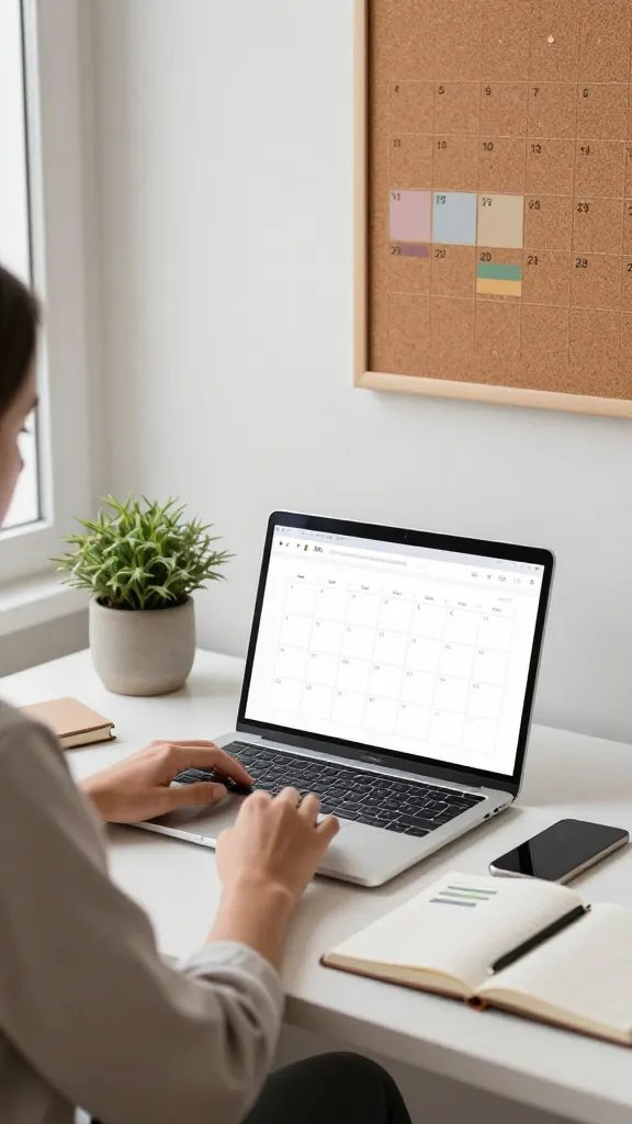
Consistency beats intensity. A lean calendar keeps you posting regularly without burnout.
Plan themes by week, map campaigns, and reserve slots for spontaneous content that still fits your aesthetic.
Benefit: fewer last-minute scrambles and more predictable engagement patterns. Trust me, it feels like winning the day when you have a plan.
16. Optimize Your Visuals for Accessibility
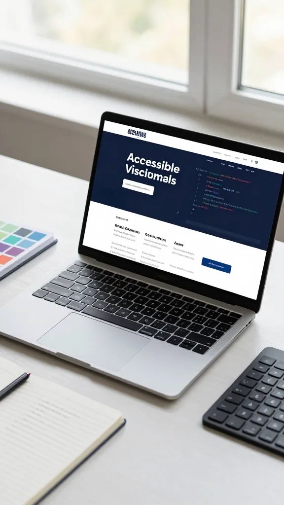
Good design should work for everyone. Choose color contrasts that pass accessibility tests and add alt text to images.
Accessibility isn’t a gimmick; it expands your audience and shows you care about all potential customers.
Quick wins: high contrast palettes, descriptive image captions, and keyboard-friendly navigation.
17. Create a Community-First Aesthetic Playbook

End with a living document that your team can reference whenever you publish. This playbook captures aesthetics, tone, and process.
Update it as you learn what resonates with your audience. A living guide helps everyone stay aligned and confident.
Final thought: when your brand feels like a trusted friend, people stay, engage, and return for more.
So there you have it — 17 practical, stylish ideas to build a stunning online presence that feels like you. Start small, batch what you can, and watch your vibe go from nice to legendary. You’ve got this, and your audience is ready for the upgrade.